Buttons
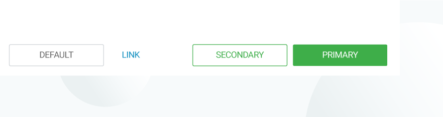
Buttons highlight actions available on a screen with a click or tap. It is used to perform a specific action and should not be used as a navigational element.
Types of buttons
Fluid defines 3 key types of buttons:
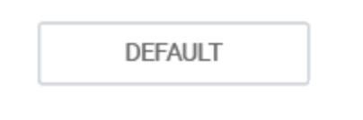

Default button
Default buttons are used to denote any action on the page. Use Default button to represent any action on a page. Can be used any number of times on a page.
 |
Basic Styling:
|
 |
Font Color: #666 Background-Color: #FFF |
| Font Color: #FFF (White) Background-Color: #808793 |
|
| Font Color: #FFF (White) Background-Color: #808793 Opacity: 60% |
Primary button
Use Primary button to denote the primary call to action on the page. Used only once on a page or modal.
 |
Font Color: #3FAE2A Background-Color: #FFF |
| Font Color: #FFF (White) Background-Color: #429929 |
|
| Font Color: #FFF (White) Background-Color: #3FAE2A Opacity: 60% |
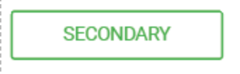
Secondary Button
Use the Secondary button To denote the secondary call to action on a page. Used with primary call to action button to represent the second most important action on the page or modal.
 |
Font Color: #3FAE2A Background-Color: #FFF |
| Font Color: #FFF (White) Background-Color: #429929 |
|
| Font Color: #FFF (White) Background-Color: #3FAE2A Opacity: 60% |
Links
Use links to highlight any interactive text. Can be used any number of times on a page.
 |
Color: #1491C1 |
| Color: #1491C1 Text Decoration: Underline |
|
| Color: Default |
Warning, Error Buttons
These buttons are used on modals and/or notifications to indicate an action that may cause a long-lasting or irreversible change.
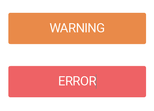
| Warning Color: #E98A40 |
| Error Color: #EF6162 |
Guidelines
- Use Primary button only once per page
- Use Default button for all other use cases
- Use any other colors than those shown above