Modals

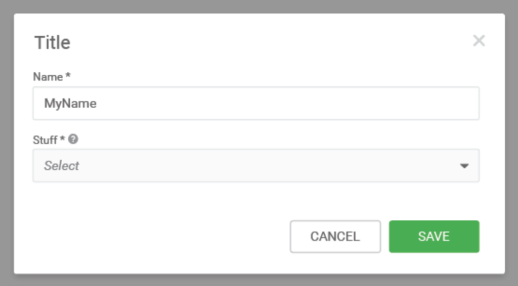
Modals communicate information via a secondary window and allow the user to maintain the context of a particular task. A user needs to actively dismiss a modal. A modal should not disappear on its own.
Modal Design
Modal Specifications
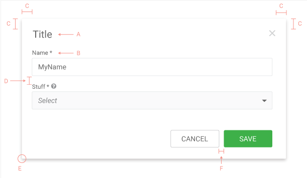
| A | Roboto Regular 20px #666 |
| B | Roboto Regular 12px #666 |
| C | Padding: 20px |
| D | Padding: 15px |
| E | Border-radius: 2px |
| F | Padding:10px |
| G | Background of the page: #808080, 50% |
| H | Background of the modal: #ffffff |
Confirmation Modals
Critical task confirmation
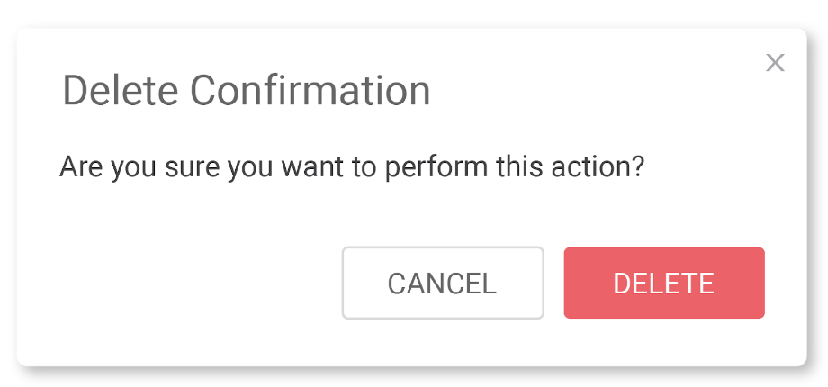
| CTA Background | #EF6162 |
Warning Task Confirmation

| CTA Background | #E98A41 |
Guidelines
DO
- Use modal when you want to perform an action on the page without loosing the context.
- Modals can have their own navigation
DON’T
- Modals shouldn’t launch other modals.
- Use scrolling only when absolutely needed.
One Response
The padding around title is 20px