Alerts
Alerts are messages that convey critical information about the system to the user. An alert message needs to concisely convey the critical message and allow the user to perform some action in order to alleviate the situation.
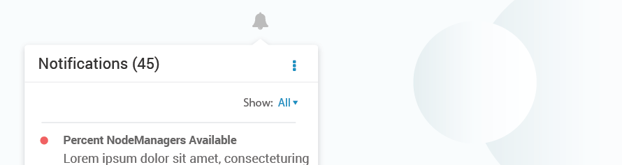
Alerts Panel
Alerts are stored in the alerts panel, which can be accessed using an alerts icon in the the navigation. The key components on the alert panel are:

| A | Alerts Icon |
| B | Alerts header |
| C | Actions (disable, skip, archive, settings, etc.) |
| D | Filters |
| E | Alerts Body (Title, Content, Timestamp, Action on Hover) |
| F | Main Actions, Show All |
Alerts Panel Specifications
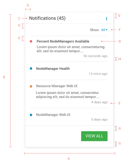
| A | Width: 300px |
| B | Height: auto, Min-height: 300px |
| C | Header: Roboto regular 16px #333333 |
| D | Alert Name (Unread): Roboto Bold 12px #666666
Alert Name (Read): Roboto Regular 12px #666666 Alert Body: Roboto Regular 12px #666666 |
| E | Timestamp: Roboto Regular 11px #999999 |
| F | Filter: Roboto Regular 12px #666666 |
| G | Padding: 15px |
| H | Padding: 10px |
Guidelines
DO
- Alerts panel can be popovers or in-page panels
- Alerts can be sorted based on time, severity, component etc
DON’T
- Do not use vertical scroll within an alert. Use ellipses and show the entire content on hover or navigate to a different page.