Notifications

Notifications give users helpful information, such as alerts, warnings, and tips, without completely stopping them from completing the task they’re doing.
Design Guidelines
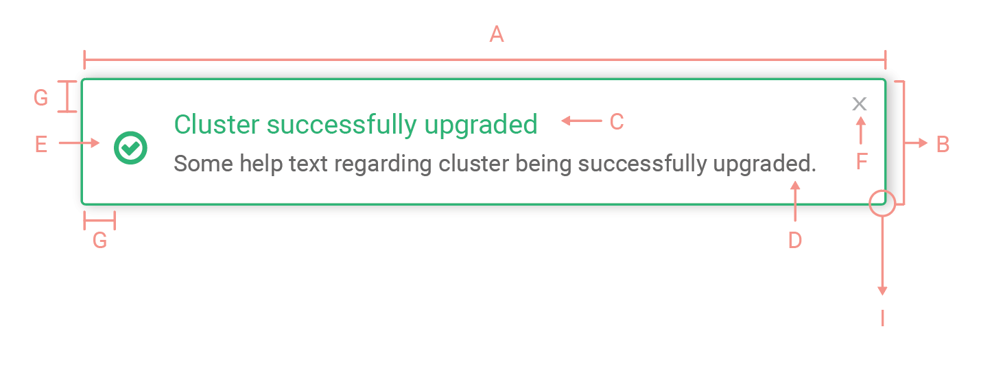
| A. | Width: Auto |
| B. | Height: Auto |
| C. | Title: Roboto regular, 14 px, Variable based on Alert |
| D. | Body: Roboto regular, 12 px, #676767 |
| E. | Status Icon: 24 px, #1EB475 |
| F. | Cancel Icon: 10 px, #999999 , Padding 10px |
| G. | Padding: 15px |
| H. | Border: 1px solid #1EB475 |
| I. | Border radius: 2px |
Types of Notifications
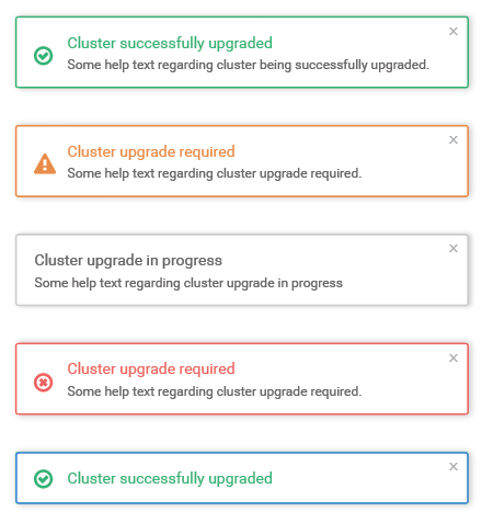
| Default | Border, Icon and Tile color: #CCCCCC |
| Warning | Border, Icon and Tile color: #ea8a40 |
| Error | Border, Icon and Tile color: #f16262 |
| Successful | Border, Icon and Tile color: #1EB475 |
| Without Description | Border, Icon and Tile color: #f16262 |
Guidelines
DO
- If you need to display more than one message on a page, you can stack them vertically and combine them with other message types.
- Notifications may or may not have a Call to Action to allow users to fix the issue.