Inputs

Inputs are used to enter information in forms.
Design Specifications
Basic Styling
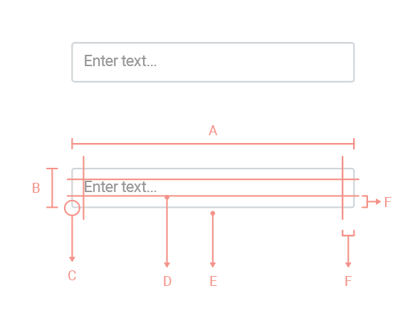
A. Width: varies
B. Height: 34px
C. Radius: 2 px
D. Font: Roboto regular / 14 px / #666
E. Border: 1 px solid #CFD3D7
F. Padding: 10 px
Input Interactions
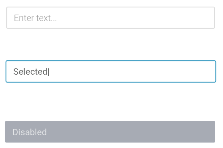
| Default |
| Font Color: #999999 |
|
Selected |
| Font Color: #666 Border: 1px solid #1291C1 |
|
Disabled |
| Font Color: #DBEE2 Background-Color: #808793 Opacity: 60% |
Input Validation

| Valid Entry | ||
| Icon Color: #1EB475 | ||
| Border: 1 px solid #1EB475 | ||
|
Invalid Entry |
||
|
Input Add-ons

Style is same as default inputs, drop-downs and buttons
Guidelines
DO
- To assist the users, you can add help text. If the explanation is lengthy, use an “info” icon and tooltip.
- You can also use placeholder text to provide an example of the type of input required. For example, in a Date field, show a name in the MM-DD-YYYY format.